For this post, I found a chart with some good elements and some bad elements. Mostly bad elements. We can have a good time ripping apart bad charts, and maybe learn a little bit along the way. Let’s begin!
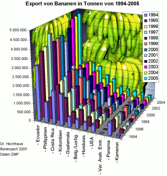
First up is this chart:
Data visualization is my passion.
The cool thing about data visualization is that even a layperson can tell which charts are good. Being intuitive to a wide range of people is what makes it good. So what we see here is an example that everyone, literally everyone, can tell leaves a lot to be desired.
First of all, the color scheme looks like a rave party. My first intuition is that the columns of a similar color are the same country, but the chart actually shows the colors are for years. If the colors represented countries, then the chart would be more readable because it would be easier to see the rises and falls of each country at a glance. Also, the 3D angle of the chart makes it hard to compare the bars in the middle to the axes. Hoe many bananas did Ecuador export in 1994? That may be (relatively) easy to answer. But how many bananas did Guatemala export in 2000? I have no idea. It would be faster to Google it than stare at this chart to try and find out.
And the bananas don’t help.
If you have to squint at a chart, pore over it endlessly, then it is a bad chart. The point of charts is to help humans understand and contextualize raw numbers that otherwise would not be very understandable. People can catch on quickly and find new relationships between things when they see them in a well made, intuitive chart.